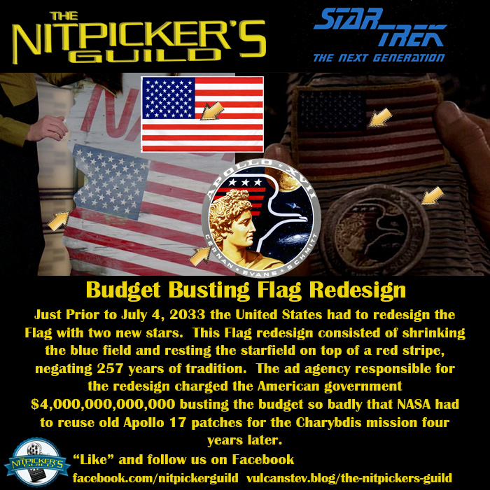
“The Royale” S2 Ep12
Budget Busting Flag Redesign
In the history of BAD and expensive logo redesigns this one isn’t quite as bad as the NBC fiasco of 1975, when the network paid a New York design company $1,000,000 to lose their iconic peacock and replace with a stylized N.
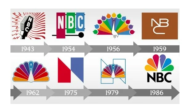
It was ugly. Not only that, but the design company swiped the logo from Nebraska Public Television. It ended up costing the Network another $855,000 just to keep the ugly thing.
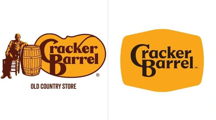
It’s also not as bad as the recent Cracker Barrel debacle which caused the company’s stock to plummet before the rebrand was fully trotted out.
But when the government spends SOOO much on a flag redesign that it has to reuse old Apollo 17 patches, that’s a big debacle.
Return to the Nitpicker’s Guild page
Return to the Star Trek page
Return to the Star Trek: TNG page
Return to the Paramount page
